In an effort to increase PowWowNow’s activation rate, we redesigned the customer account area with the priority of encouraging users to start and join meetings.
User research & flows
UI/UX design, interaction design, prototyping
Chris Pearce - Operations Director
Stephen Ward - Head of Development
Hayley Dawson - Project Manager
The current account area had an excruciating amount of dead ends and broken user flows. The priority is always to encourage the user to start and join meetings but it was important that they didn’t get frustrated or lost in trying to do so. How could we improve the account area and provide an efficient product for the user?
Empathising with our user pain points was essential to how we were going to structure the new account area. We prioritised a few key features, that would be most valuable and feasible, that would enhance the account area.
Not having a single source of truth for important tasks created a messy system for the account area, particularly account administrators. They needed to be guided on how best to use the product in the most efficient manner.
Giving conflicting real estate to all the menu options overwhelmed the users when they logged in. There was no clear hierarchy in place which nudged the user in to the account area’s priority user flows.
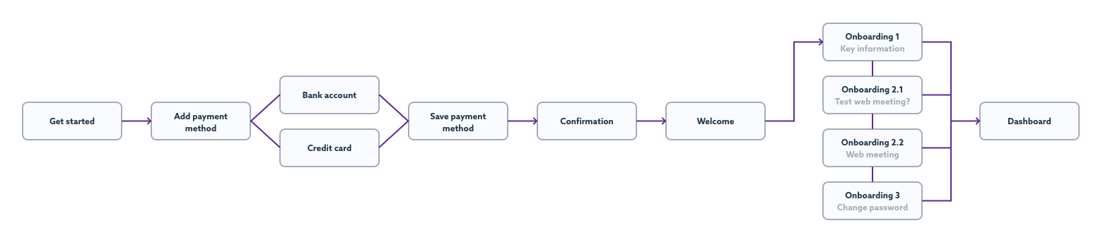
Users can often find that hosting meetings can be a daunting task. Whether it be the technology or talking to groups of people, we needed to help reduce the stress of hosting a meeting. Introducing an onboarding flow that could help the user get to grips with the key features was an ideal place to start.
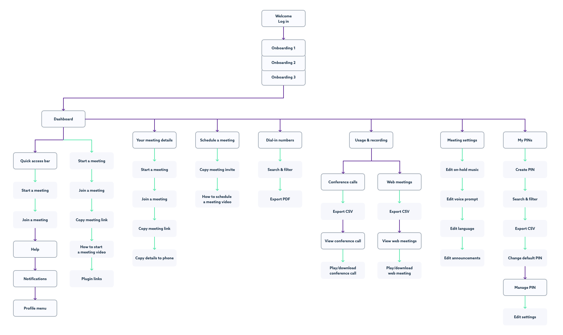
Collaborating with key stakeholders allowed us to prioritise content and improve user flows. We used card sorting sessions (with project members and the customer service team) to identify and focus on each page objective, which produced clear wireframes and a structure to take forward.
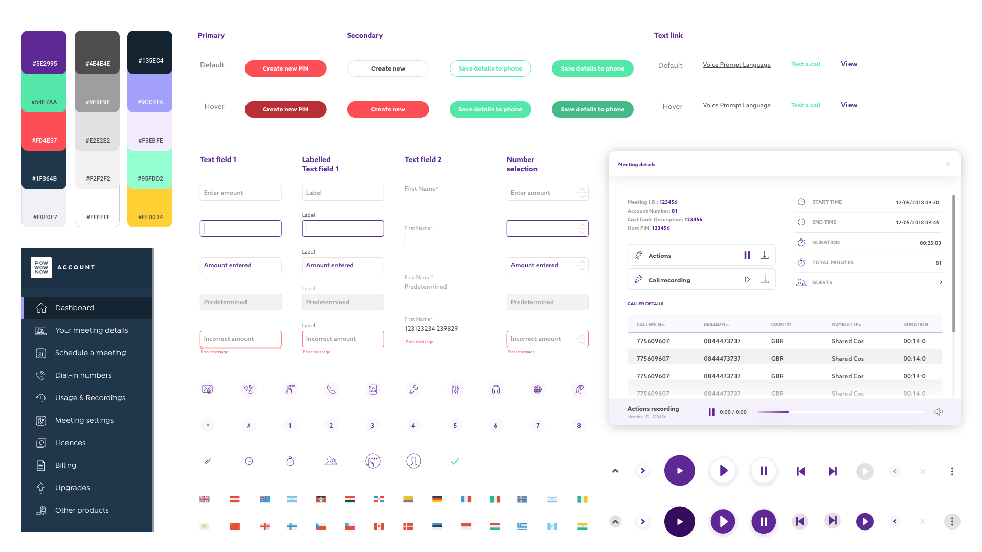
I implemented a design system based on Atomic Design by Brad Frost. The interface is shaped by the design system, it provides confidence, consistency and clarity throughout the process and with development.
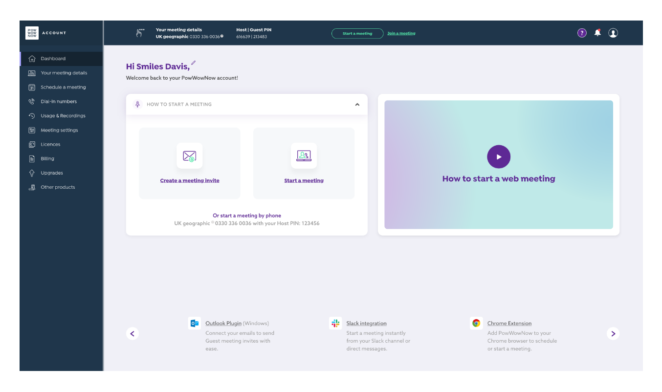
Users need to know where they are at all times. We placed the menu tray on the left and added another static navigation bar at the top which included key meeting information and call-to-actions. Now users knew that they could jump into a meeting during any task with ease. Creating consistency for product users allows them to work in a more efficient manner.
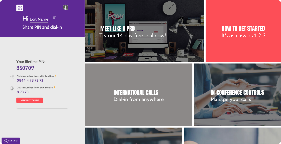
Before - Dashboard included cards which linked to each menu option. Once clicked the user lost the key information down the left hand side as the menu option went full width. This layout also doesn't guide the user to start and join meetings.
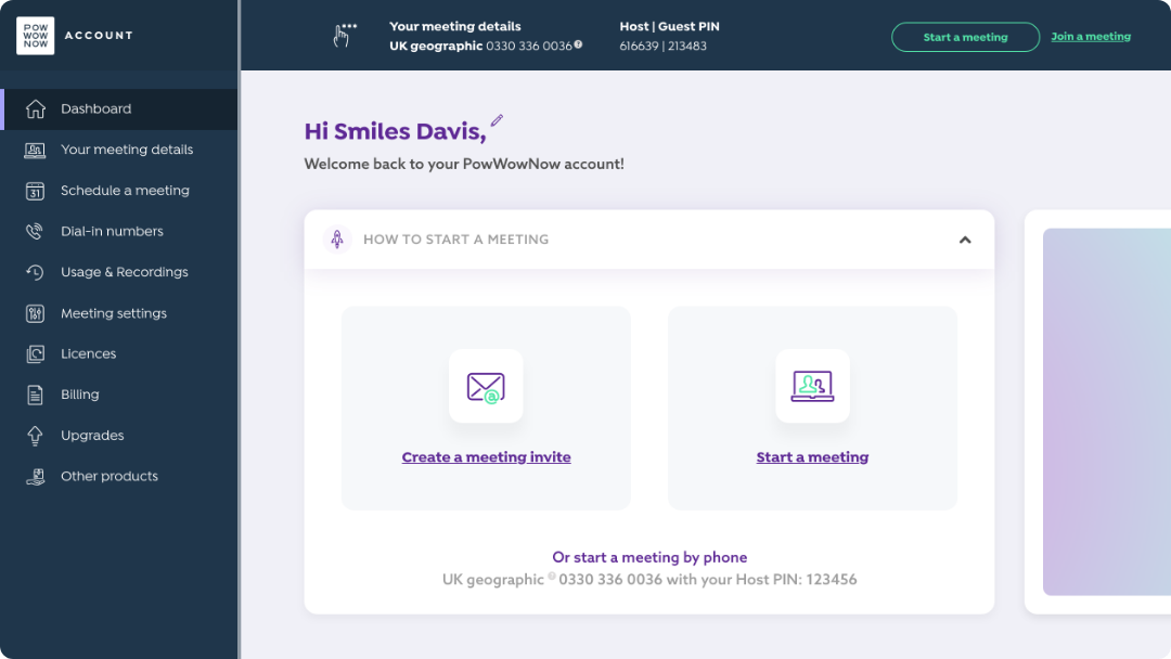
After - Menu tray and quick access bar (top) gives the user a more traditional product view, this allows them to work in an efficient manner without frustration.
Hosting a meeting can often be an anxious experience - if new users weren’t comfortable with the product they would be less likely to activate. We wanted to reduce the stress of using a product for the first time. We introduced onboarding cards to the account area that would allow users to test and get familiarised with the product in minutes.
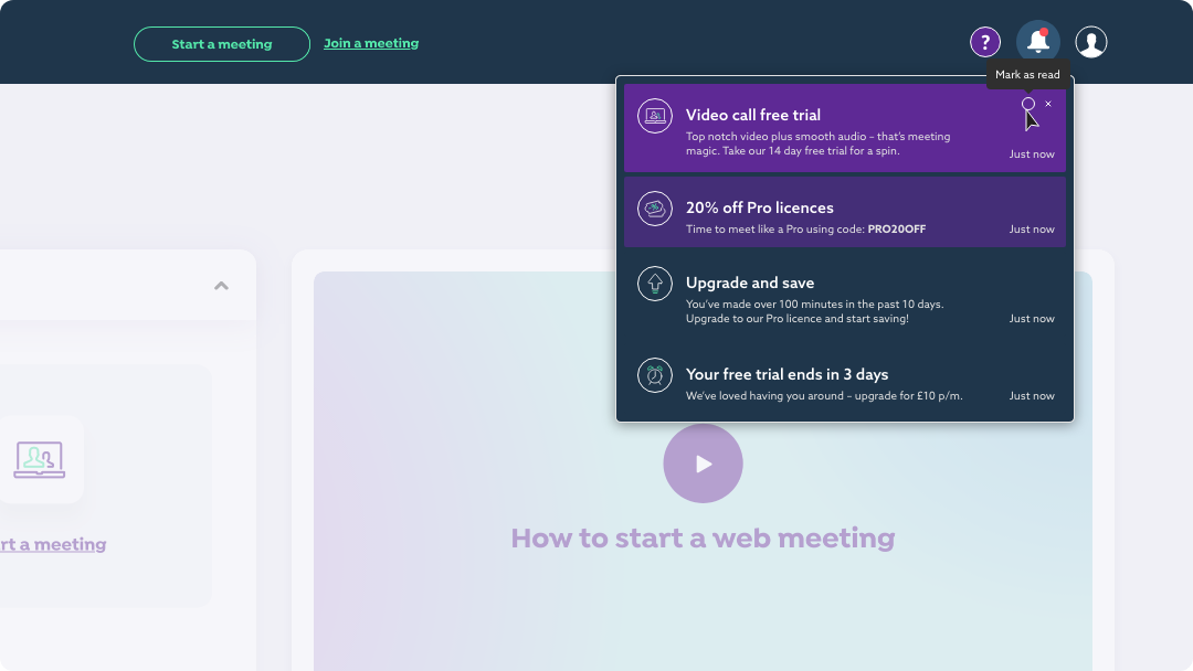
A last minute project inclusion - we introduced notifications to the account area as a tool to keep users informed of their latest milestones, download links and offers. It was an opportunity to add a human element to the product as a way of communication with the user. We could also use this function to encourage users to try a test meeting, after tracking that they hadn’t had their first web meeting yet.
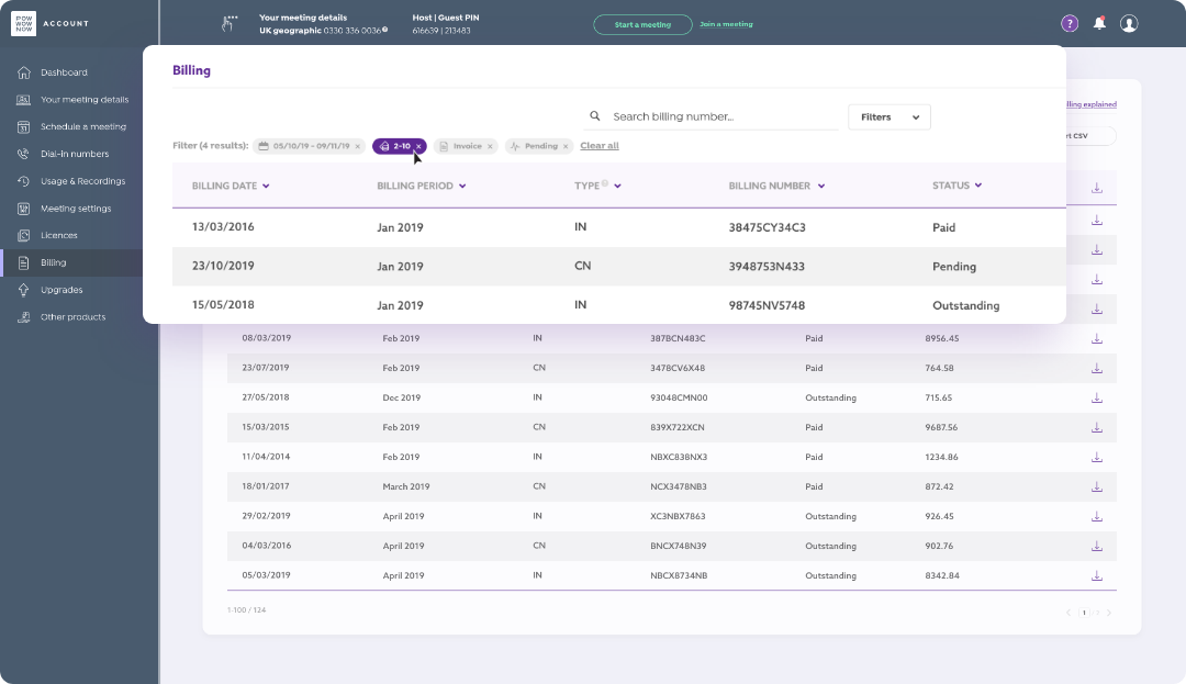
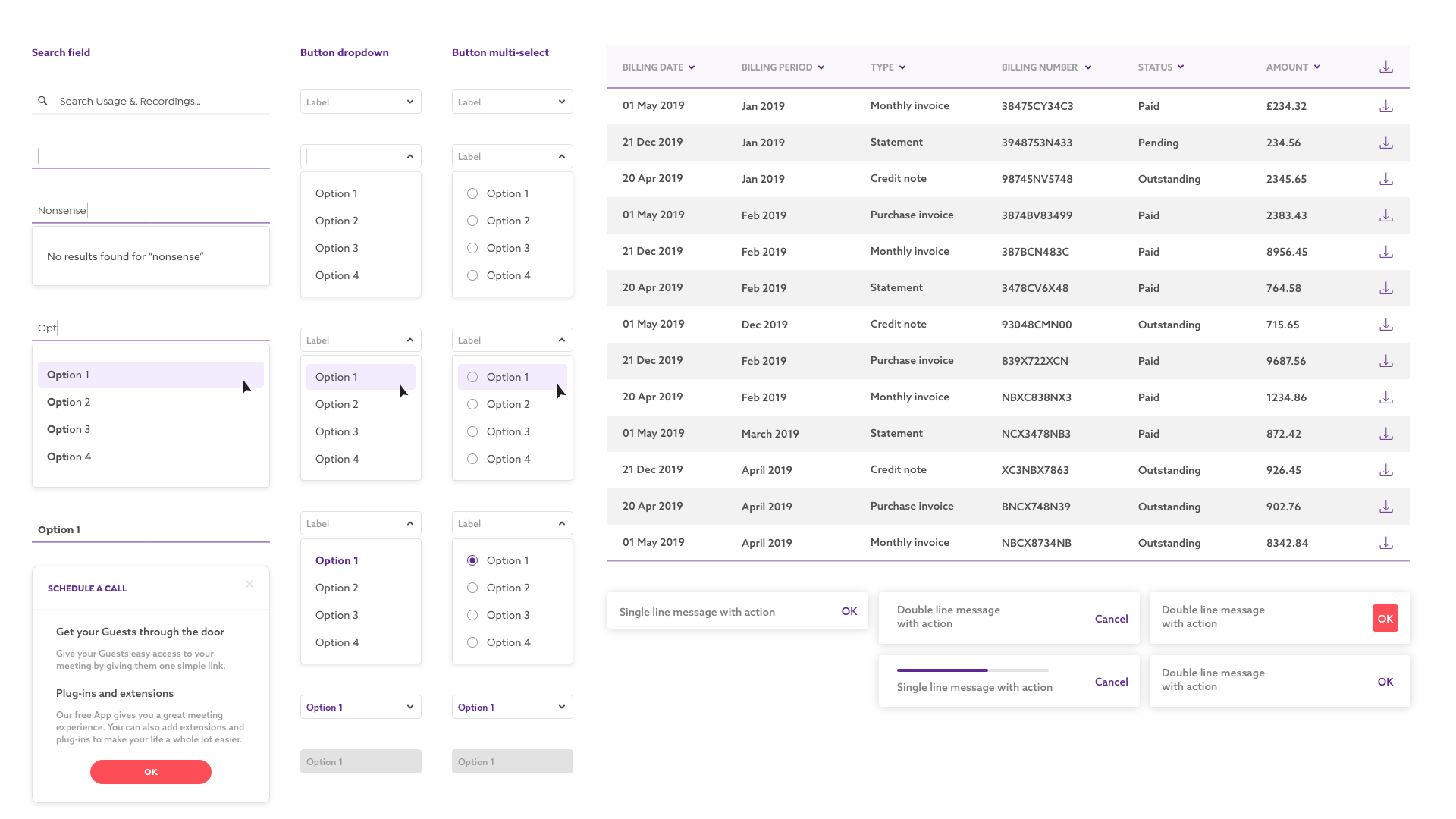
This new feature was at the forefront of customers requests. Monthly bills were currently emailed to admins, which isn’t best practice. We created a page where admins could view and download their bills, and make changes to payment methods. Adding these key functions allowed admins to acquire key information where previously a phone call to customer service was required.
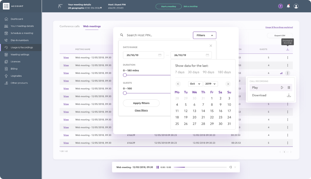
Users have the ability to record meetings and each file is available in the meeting host’s account. We removed unnecessary information that flooded meeting files and improved accessibility throughout the whole account. Users were now able to filter table data and download all recordings at once.
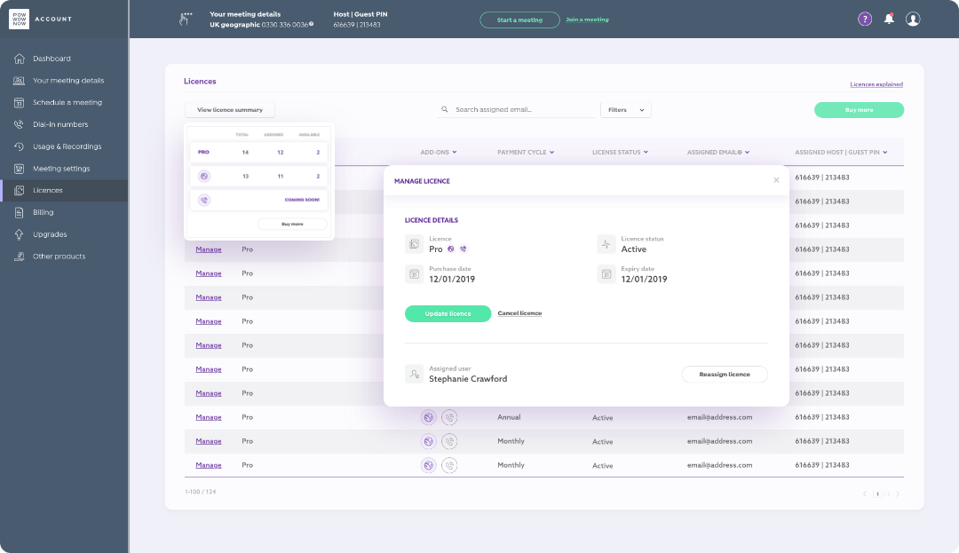
The licences page posed our most technical challenge throughout the entirety of the project. Another popular request, by admins, was to be able to make changes to current licences in their accounts. Again, admins currently had to make any changes via a customer service phone call, which was time consuming and frustrating - this often resulted in accounts being flooded with expired licences. We created an area where admins could not only allocate licences to different members of their team but also upgrade and downgrade licences without having to go through the website funnel.
Deploying the update of this project was a really exciting time – the first level of customers saw their new account area after a years worth of work, in April '20. To be an integral part of this project (even to this day – March '21) and work closely with heads of department allowed us to create a real methodical work ethic. We've asked questions, learned and evolved as a team and we're continuing to get feedback from users and iterate on the designs to improve the user experience.