
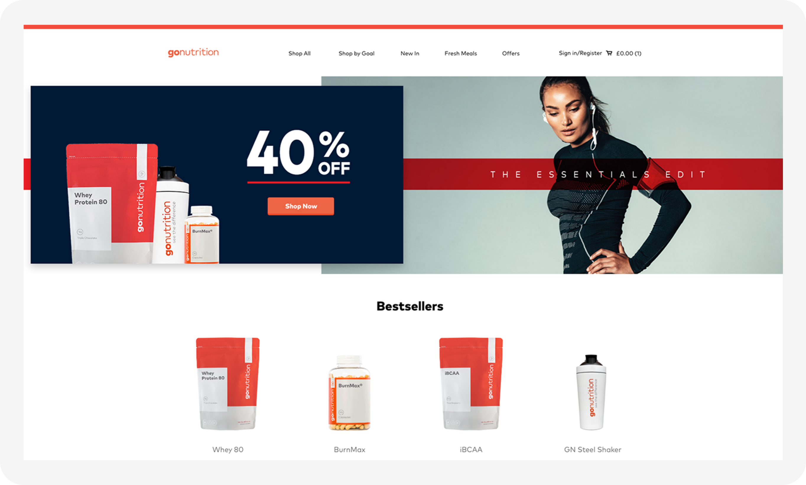
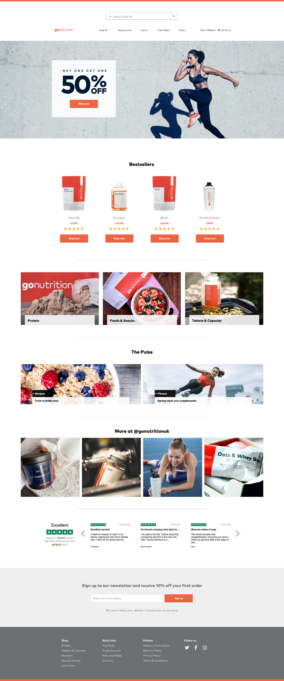
Gonutrition was heading into a new era with their upcoming rebrand. We were tasked with updating their existing website and increasing user retention.
Discovery and ideation
User research & flows
UI/UX design, interaction design, prototyping
Art direction
Sam Gill - Head of Marketing
James Sims - Head of Development
Meaningful engagement on Gonutrition’s website was low - users seemed happy to browse and add products to their carts but there was clearly an issue with the flow after this stage. Due to the nature of the industry the high discount sales proved effective but we needed users to come back and purchase when those offers weren’t on. How could we improve the website to such an extent that users would happily purchase outside of sale periods?
We wanted to understand why customer retention was so low on the website. Through user interviews and market research it became clear that the primary user objectives for key pages were getting lost amongst the numerous offers and links. We refined the issues down to 3 main points.
Users were dropping off the site at key stages - they were comfortable browsing and adding products to their carts but were not converting after this.
Users tend to sign up to Gonutrition and purchase in the sales while staying loyal to other popular brands for monthly use.
Product and cart pages contained numerous links, such as ‘customers also bought’, that often stole user focus from the primary page objective.
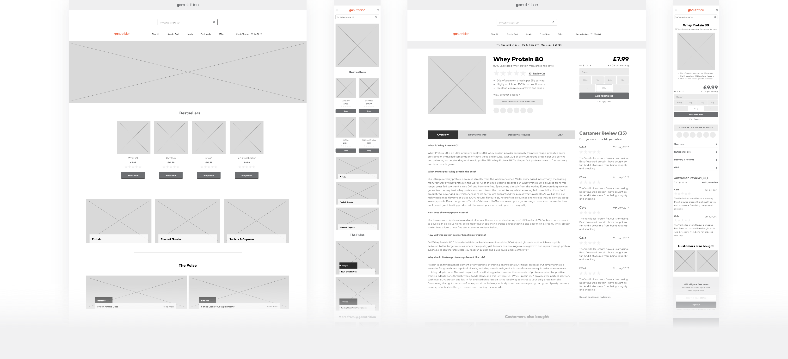
Collaborating with key stakeholders allowed us to prioritise content and improve user flows. We used card sorting sessions to identify and focus on each page objective, which produced clear wireframes and a structure to take forward.
We had one primary message: you can trust Gonutrition. We needed to refine the user flow from basket to purchase confirmation. If users found that they could trust the flow and complete it with ease, they would have a good reason to come back and purchase again.
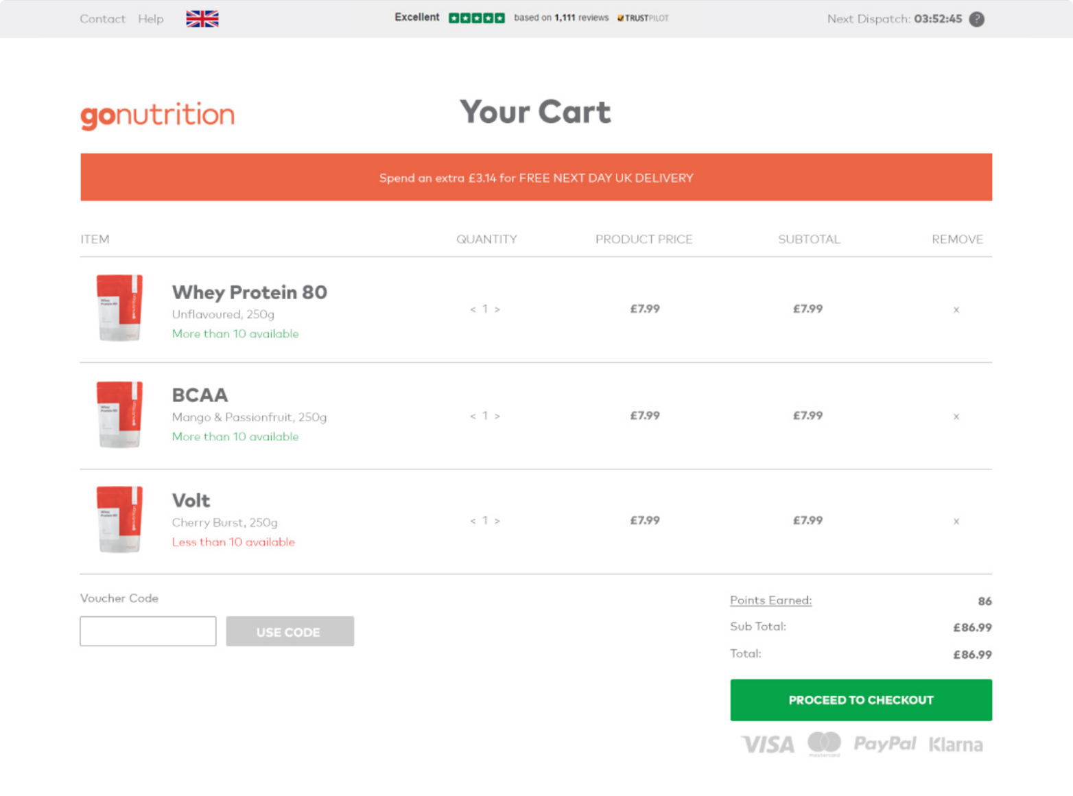
Cart now has no external links with one main call to action.
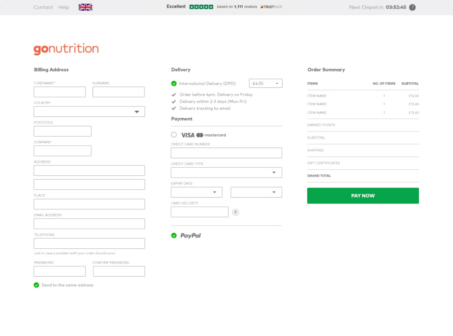
Checkout now has a clear process, the additional payment options gave our brand strength and was imperative to building trust.
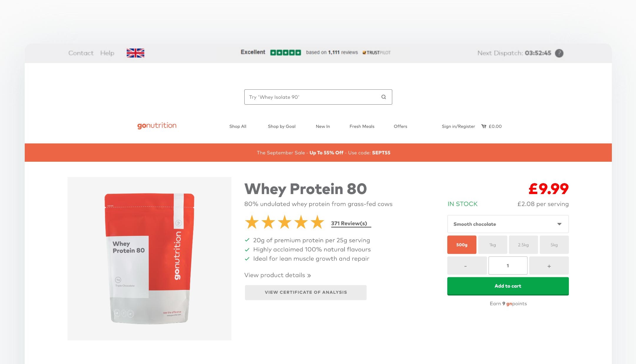
Gonutrition had a poor structure for their product pages. There was no primary focus due to the button colour clashes, discount code reminders and the numerous external links that were level with the primary call to action.
We restructured the page content so the sole focus was to choose your product requirements and simply ‘add to basket’.
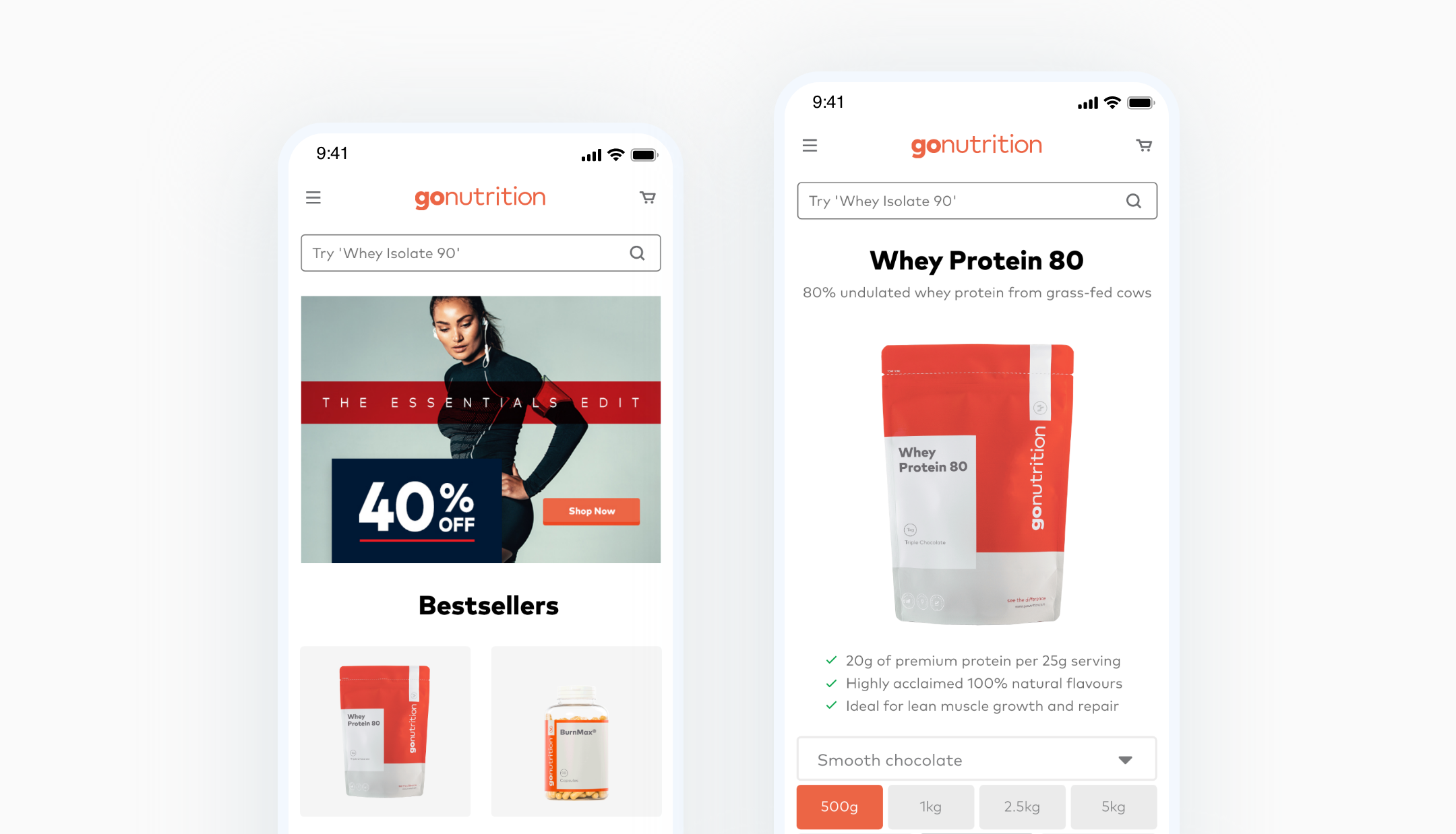
The percentage of mobile traffic was increasing every year and Gonutrition’s handheld presence was unfit for quick and easy purchasing. The call to actions were often too far down the page and the sheer amount of content had to be reduced.
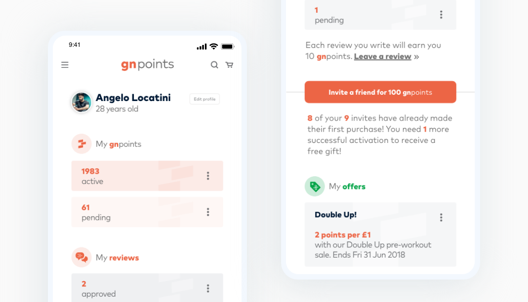
Gonutrition already had a points based rewards club that allowed subscribed users to build up and exchange points for vouchers and free gifts etc. They didn’t make any effort to show the users how they could profit from spending more, either on the website or on any of the social channels.
We added a section onto the product page that showed users just how much they were earning with every product. This was a key step in educating the user about their product choices and it encouraged them to come back and earn more.
Releasing the website was the final piece of the rebrand puzzle and it kick started the next phase of this project perfectly. After an initial and expected increase in site traffic and sales we saw that the homepage and bestselling product pages had a dramatic drop in bounce rate.
We introduced a new process for design and development, which was now being filtered into other departments across the marketing team. This process really helped the team to stay on track even with various last minute changes and requests.